Let's Go Digital! Print magazines were having a digital revival in the '90s. Crayola Kids Magazine, published bi-monthly by Meredith Corporation, offered a variety of art styles, games and stories for young readers. It was my first foray into this type of publication and I absolutely loved it! Every couple months, I worked on anywhere from one to three activities, spot illustrations or promotional web items. It was also my first step into the world of digital art. I remember the day I walked into the Crayola offices and saw all the drafting tables, drafting arms and markers being pulled out and replaced with computers. I was very young and out of school, but thought, "Uh, oh... this looks like trouble." I asked everyone I worked with, "Would you like it if I got a computer and started going digital?" Crayola said "YES!", Fisher-Price said, "YES!" I thought about it and then Bob Riley, the art director at Crayola Kids called. My phone conversation with him went something like this, "You can do the art any way you want, as long as it looks good, but we'd prefer digital if you can do it, and we need it in one month." I said, "Sure! I can do it digitally." I hung up the phone and went out and bought a Macintosh Quadra 605 computer, Photoshop, Freehand and Adobe Streamline. I had one month to figure all this out. The game was What's Different? to be included in the upcoming dinosaur issue. Hand inked on vellum, scanned and converted to vector. The art was very simplistic compared to the art I am doing today, but at the time, there were so many obstacles, beyond frequent computer crashes, tube-styled monitors and using a mouse. On top of this, I couldn't email the file and the file had to fit on a 1.4MB floppy disc (Syquest and ZIP Drives were still out of reach). And these limitations went on for quite a few years. It was a golden age for FedEx. The job got done, I figured out how to make an illustration in the computer, I sent off my invoice, and more digital work rolled in soon after. 
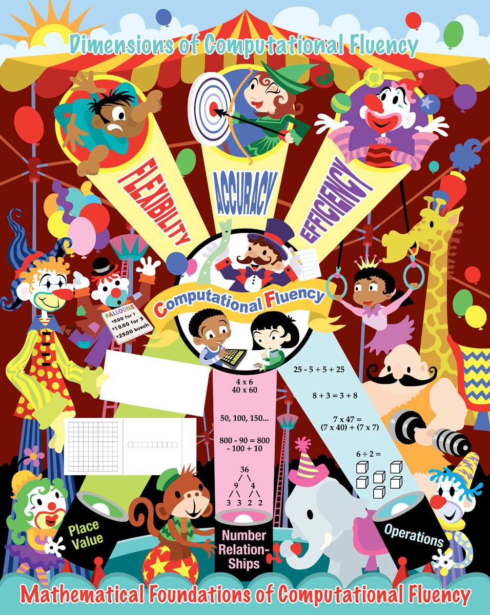
Bigger And Better Things! I worked on the magazine for about five years, writing and illustrating games. Multiple computers and programs later, the illustrations were getting more complex. Some being built entirely in the computer. Many, still being hand-inked, scanned and added on from there. The ROW, ROW, ROW series as we referred to them, were some of my favorites. I became the "go-to-guy" for these, writing and illustrating about twelve in all. Here's one I always liked, 9 Shipmates In A Row. Eventually, I began getting commissions from Sesame Street Magazine, Kid City, Scholastic, Better Homes & Gardens, and even Esquire to write and create children's magazine activities. It became the stepping stone for my future work with corporate promotional books and kids restaurant menus.   Early in my career, I did some editorial illustrations for magazines. This one was for Yankee Magazine which devoted it's pages to life in New England. The art director had seen my work on a series of Halloween illustrations and wanted three black flies that resembled vampires. Cool! As a kid living near Upstate New York, I was more than familiar with the nuisance of little black gnats that would swarm around everyone's heads. Summer happiness was dictated by the outbreak or lack thereof of these horrible little monsters. Kids pretty much wore baseball caps all summer. The best solution, besides spraying yourself with insect repellent, was to burn punks. Punks were basically incense on long thin sticks that resembled pond water cattails. I used to light two or three of them and stick them on top of my baseball cap where they would burn and encircle my head with a fine smoky mist that created an impenetrable barrier against the flying gnat armies! I thought I looked pretty darn cool! But, then, I was just a dopey little kid. The only time I have ever seen them mentioned in print was in the autobiography Moe Howard & The Three Stooges. Moe talks about "burning punk" to keep away the gnats. Moe knew what he was doing. Well, finally onto the art! It was commissioned as three small spot illustrations for a side article called "New England By The Numbers". The article listed numeric facts about the black fly population in New England. Seems they have a problem with gnats, too. Maybe they just need to burn some punk?  I remember the day I received an email inquiring if I would be interested in taking on an assignment to illustrate a poster about "the dimensions of computational fluency". At first I thought, "What is this?" and then I thought, "There's no way I want to take this job!" But then I read further and discovered that the poster was going to be a circus tent with clowns, animals and performers! How cool! A chance to take a very serious and often dry subject such as math and make it visually appealing to grade school kids. Of course I accepted the job! The poster is a 16" x 21" stapled pull-out inside a quarterly classroom magazine for the National Council Of Teachers Of Mathematics. The basic layout for the poster was supplied by the client and followed an established design for computational fluency. Sometimes, it's really nice to have a structure in place while working out the look of an illustration, especially when it involves technical issues. Other times, it can be challenging or even burdensome. In this case, it just made my work a lot easier, so I was grateful to have it.  I started with a very small thumbnail sketch just to get thinking about it. I often do more thinking than rough sketching and like to have a solid visual in my head before I start any serious sketching. Next I did a rough sketch on tracing paper in marker. Marker? It's one of the few times I ever did a rough sketch using marker. Not sure why, but there it is! I sent the marker sketch to the Senior Designer at The Magazine Group in Washington, D.C. and it was approved with a few minor changes, primarily the banner at the top. I thought a big waving banner with the words FLEXIBILITY, ACCURACY, and EFFICIENCY would look neat being hit by the spot lights. This was nixed, for good reasons. The new layout with each word inside the light beams was a lot better! There were a few character changes, clowns were to be less "hobo" looking, and gender and racial representations were discussed. I was ready to work on the tight pencil sketch. The tight pencil sketch went through with no changes that I can recall and I was ready to create the flat color layout in vector using Adobe Illustrator. I make flat vector art for two reasons: 1) It gives me a close to finished look in color and layout that I can send to the client for approval, prior to starting the painting. 2) I can create each piece of the illustration in layers and easily move or scale things as needed without any destruction of the images that can occur in Adobe Photoshop when painting with pixels. The final art was digitally rendered using Photoshop. You can click through the gallery of images below to see the progression of the art. I was really happy with the final production. The printing came out spot-on and the colors were incredibly accurate. The Dimensions Of Computational Fluency math poster was a big challenge, but a very rewarding project to work on and I'm not clowning around, either! • Publisher: The Magazine Group of Washington, D.C. • Senior Designer: Janelle Welch. • Poster front design: Janie Schielack and Tim Boerst. • Illustration: Joe Lacey. On a side note, shortly after I had completed the poster, I was contacted by a music band in Spain called La Herejia asking if they could use one of my clowns for their new CD "Malabares". Since I owned the rights to the images, I agreed. Funny where things end up. A veces, la vida es un circo ambulante. |

BOOKS
by Joe Lacey 


Categories
All
IllustratorsLinksArchives
May 2023
|


 RSS Feed